

こんにちは、なかにしです。
今回はUIカタログの「Storybook」を試してみようと思います。
Storybookとは
オープンソースのUIカタログです。
作成したUIコンポーネントを、ブラウザで手軽にチェックすることができます。
React以外、Vue、Angular、Svelteなどに対応しています。
インストール
以下でインストール & 初期設定を一括でやってくれます。
npx storybook init▽ 入力するとガチャガチャ動き、初期設定が終わりました。
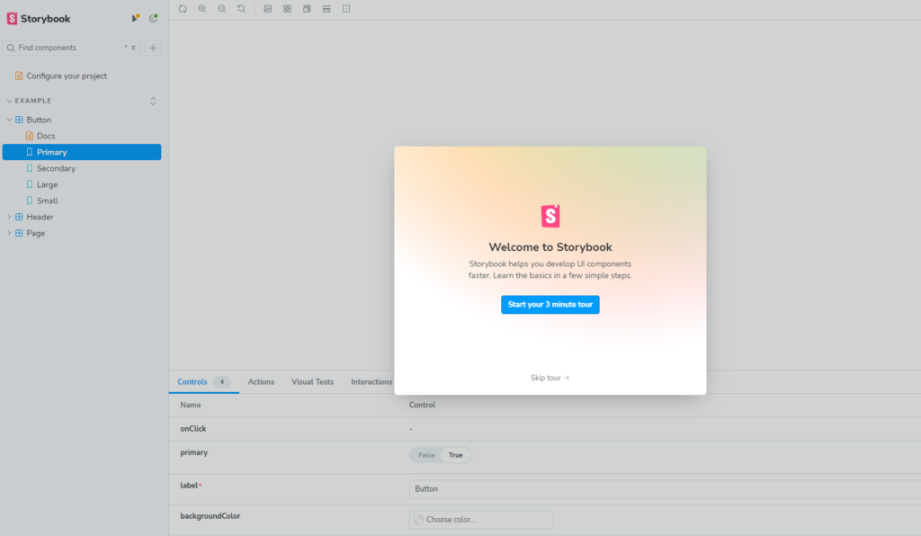
コンポーネントの確認
それでは、storybook上でコンポーネントの確認をしてみます。
もし一度サーバーを閉じた場合は、以下コマンドでstorybookを再起動できます。
npm run storybook6006ポートで無事に立ち上がりました。
初期状態では、「EXAMPLE」というディレクトリに、いくつかのコンポーネントが入っています。
まずは画面上でどんなコンポーネントなのか確認してみます。
これらのコンポーネントは、src配下の「.stories」に定義されています。
▽Button.stories.ts
import type { Meta, StoryObj } from '@storybook/react';
import { fn } from '@storybook/test';
import { Button } from './Button';
/**
* ここからstorybook上で表示する名前などを定義
* 以下は「Exampleディレクトリ配下」に
* 「Buttonという名前のボタンコンポーネント」を登録している
*/
const meta = {
title: 'Example/Button',
component: Button,
parameters: {
layout: 'centered',
},
tags: ['autodocs'],
argTypes: {
backgroundColor: { control: 'color' },
},
args: { onClick: fn() },
} satisfies Meta<typeof Button>;
export default meta;
type Story = StoryObj<typeof meta>;
/** ここからボタンの種類を定義 **/
export const Primary: Story = {
args: {
primary: true,
label: 'Button',
},
};
export const Secondary: Story = {
args: {
label: 'Button',
},
};
export const Large: Story = {
args: {
size: 'large',
label: 'Button',
},
};
export const Small: Story = {
args: {
size: 'small',
label: 'Button',
},
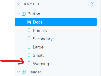
};上記を見ると、現在はボタンの種類として4種類登録されています。
試しに、1種類増やしてみます。
/** ここからボタンの種類を定義 **/
export const Primary: Story = {
  args: {
    primary: true,
    label: 'Button',
  },
};

export const Secondary: Story = {
  args: {
    label: 'Button',
  },
};

export const Large: Story = {
  args: {
    size: 'large',
    label: 'Button',
  },
};

export const Small: Story = {
  args: {
    size: 'small',
    label: 'Button',
  },
};

/** 追加  **/
export const Warning: Story = {
  args: {
    primary: true,
    label: 'Delete now',
    backgroundColor: 'red',
  }
};
▽ すると、Warningボタンが増えました。
上記のように、コンポーネントをstoryに登録し、画面上で動作確認ができるようになっています。
いちいちページ上に配置しなくて良いので、これは便利。
コードの変更とブラウザでの表示は双方向になっています。
コードを変更して保存するとブラウザでの表示も変更されますし、ブラウザ上で変更してもコードに反映されます。
コンポーネントのカスタマイズ
続いて、
簡単なフォームを作成してみました。
import { FormEvent } from "react";

interface Field {
  name: string;
  type: string;
  label: string;
}

interface FormProps {
  fields: Field[];
  color?: string;
  onSubmit: (event: FormEvent<HTMLFormElement>) => void;
}

export const Form = ({ fields, color, onSubmit }: FormProps) => {
  return (
    <form onSubmit={onSubmit}>
      {fields.map((field) => (
        <div key={field.name} style={{ color }}>
          <label>
            {field.label}
            <input type={field.type} name={field.name} id={field.name} />
          </label>
        </div>
      ))}
      <button type="submit">送信</button>
    </form>
  );
};
import { Meta, StoryObj } from "@storybook/react";
import { FormEvent } from "react";
import { Form } from "./Form";
const meta: Meta<typeof Form> = {
title: "form",
component: Form,
}
export default meta;
type Story = StoryObj<typeof Form>
const handleSubmit = (event: FormEvent<HTMLFormElement>) => {
event.preventDefault();
const formData = new FormData(event.currentTarget);
for (let [name, value] of formData.entries()) {
console.log(`name:${name},value:${value}`)
}
}
export const DefaultForm: Story = {
args: {
fields: [{ name: "name", type: "text", label: "名前" }, { name: "passwd", type: "password", label: "パスワード" }],
color: "black",
onSubmit: handleSubmit
}
}
export const PinkForm: Story = {
args: {
fields: [{ name: "name", type: "text", label: "名前" }, { name: "passwd", type: "password", label: "パスワード" }],
color: "pink",
onSubmit: handleSubmit
}
}
export const AddAgeForm: Story = {
args: {
fields: [{ name: "name", type: "text", label: "名前" }, { name: "passwd", type: "password", label: "パスワード" }, { name: "age", type: "number", label: "年齢" }],
color: "black",
onSubmit: handleSubmit
}
}シンプルなフォームです。
普通のフォーム、ピンクの色付きのフォーム、年齢のフォームを追加したフォームの3種類を良いしました。
▽ 動作確認
ちゃんと入力した値のログ出力ができています。
作成したコンポーネントをページに表示する
それでは、実際にReactのページに表示してみます。
ちなみに、Storybookの使用方法の記事は沢山ありますが、
なぜか実際にページ表示をするやり方に関しては見当たりませんでした。
先ほどのFormだと複雑で分かりづらいので、簡単なボタンコンポーネントを用意しました。
import "./button.css";

type Props = {
  children: React.ReactNode;
  color?: string;
  size?: string;
};

function Button({ children, color = "default", size = "base" }: Props) {
  return <button className={`${color} ${size}`}>{children}</button>;
}

export default Button;
import type { Meta, StoryObj } from "@storybook/react";
import Button from "./Button";
const meta = {
title: "Button",
component: Button,
tags: ["autodocs"],
} satisfies Meta<typeof Button>;
export default meta;
type Story = StoryObj<typeof Button>;
export const Default: Story = {
args: {
children: "Default",
},
};
export const Primary: Story = {
args: {
children: "Primary",
color: "primary",
},
};
export const Danger: Story = {
args: {
children: "Danger",
color: "danger",
},
};作成したボタンコンポーネントとStoryを使用して、画面表示をします。
import "./App.css";
import Button from "./component/button/Button";
import { Danger, PrimaryLarge } from "./component/button/Button.stories";

function App() {
  return (
    <div>
      <Button {...PrimaryLarge.args}>ボタン</Button>
    </div>
  );
}

export default App;
作成したStoryをそのまま使用できるのが簡潔で良いですね。
さいごに
いかがでしたでしょうか?
今回ご紹介したのは、機能のほんの一部です。
Storybookはまだまだ機能がたくさんあるので、
気になった方はぜひお調べいただけたらと思います。
今回はここまで!
Enjoy Hacking!!